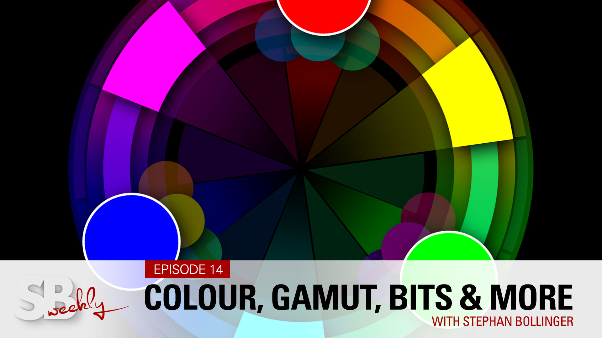
Episode 14 - Colour Explained!
SBweekly.tv - Episode 14
From Eye & Visual Cortex
Colour Gamut, 8 vs 16 bit - RGB and Lab
Colour explained - from Eye and Visual Cortex to Computer RGB and Lab, Colour Gamut, Profiles, sRGB, Adobe RGB, ProPhoto and 8 vs 16bit
The idea was to create an episode about colour grading. Some of my students, however, are still not 100% confident when it comes to "colour" itself, colour profiles, gamuts, about sRGB versus ProPhoto, 8bit versus 16bit, and in general: how we actually perceive colour. Let's clear up a few of those theoretical things so that when we jump into colour grading next week, we're all on the same page.
When it comes to "perceiving colour", there are various figures out there and I find that quite weird. Usually, you have a pretty exact measurement, but here, medical journals say the human can see colours somewhere between 2 and up to 10 million different colours. That's a huge range, 2 to 10, five times more. Some people must see a lot fewer colours than others.
Anyway, we see colours in that range. Colour is actually a very small range in the full electromagnetic spectrum and it has all to do with wavelengths. A very short wavelength would be violet. A long wavelength is red and then all the other visible colours are sandwiched in between.
How do we actually see it? With our eyes, of course, but most of the lifting actually happens in the visual cortex. We hear the term colour-blind, even though this term is wrong. Even though about 5% of the world's population is "colour-blind", they really are "colour deficient", as most see at least certain colours. It doesn't mean they completely see everything monochromatic. If you're a woman, well, you're lucky. It's only about 1 in 200 who have such a deficiency. For men, it's a little bit less lucky. It's 1 in 12. So - if you have 11 friends who see perfect colour: It might be you! By the way - there are glasses to correct certain colour deficiencies. It works for some, it doesn't work for others.
So - what does the eye actually "see" and what does the visual cortex do?
The visual cortex is really the computer that runs it all. If we look at our eye and take away all the beauty, the eyelashes, the eyelids etc, we get is the far less "pretty" eyeball. At the back of the eyeball is the Retina. In the retina, we have two types of sensors (if you wanna call it like that): The cones and the rods. The rods pick up the difference in light intensity: black and white. The cones, however, are sensitive to a certain wavelength, like I mentioned above. Depending on which wavelength come into the eye and are focused on the retina, one or the other, or all three of the cones, send the information to the visual cortex, which now takes those three values, the amount of red, the amount of green and the amount of blue, and calculates the colour that we "think" we see.
When we go to the computer and we talk about RGB, it should make sense as this is reproducing the cones in our eyes. Looking at the spectrum that our eyes can perceive, how do we now make sure that when we look at photos on different devices, it looks the same everywhere? We have to limit the colours to a common denominator.
That common denominator is sRGB. sRGB is the colour gamut that we should use for web, for social media. It works on the phone, on your tablet, on the computer. sRGB a small subset of all the colours that we can see. A slightly larger colour gamut is Adobe RGB. An even larger is ProPhoto. On your camera, you will find a setting where you can pick the colour gamut, be it sRGB or Adobe RGB. This only matters if you shoot in JPEG. As mentioned in previous episodes, we should however always shoot in raw. In raw, we record the actual sensor data, which allows us to make a color decision afterwards on the computer. If you shoot JPEG, however, switch it to Adobe RGB, to cover a larger area of colours.
Which brings us to how RGB actually produces all those different colours. I mentioned at the beginning that our visual cortex does that for us. So how does that work on a computer? With mixing Red, Green and Blue, we can produce most colours, at least theoretically. RGB is an additive colour mode. On a computer screen, we start with nothing, a black screen. Whatever we add to it will go brighter and brighter, to the point where we get white. In print, starting out with a white paper, we work in CMYK (cyan, magenta, and yellow). The more ink we put on the paper, the darker it gets. The reality, however, it will create more of a darkish yucky brown and having three layers of ink on top of each other makes it a lot harder to dry (also very much depending on the paper). So that's why we have cyan, magenta, yellow, and "K" (for black), to avoid exactly these issues.
Which then brings me to bit depth. This might be the most confusing. 8bit, 16 bit, what does that exactly mean? We hear those big numbers, 16.7 million colours or 281 trillion colours. How does this actually work? Let's focus on 8 and 16 bit, since these are the two that you will come across when you work in Photoshop. We have 8 bits of information for each of our colour channels (0-255). 8 bits for red, 8 bits for green and 8 bits for blue. If we add up how many combinations there could be, we end up at 256 possible colours per channel. Doing the maths, the possible amount of colours per pixel in 8bit is therefore 16.7 million different colours. In 16 bit, we now have 16 bits per channel, meaning that we have 65,000 colours for each channel, or 281 trillion possible colours for each pixel.
I personally find it difficult to grasp the difference between big numbers. To give you an idea of what this difference really is, let's think of it as seconds. 16.7 million seconds would be about 194 days. 281 trillion seconds, however, represents 8.9 million years! That's about eight and a half million years before the very first human sapiens walked this planet - so - yeah, a "slight" difference.
Why is this so important? Here is a very simple example: We have an 8-bit file and we have a 16-bit file. They look exactly the same because they are. It's a simple gradient as you would see in a mid-afternoon sky, with some blue tones, going into a somewhat grey-white'sh tone. If we heavily manipulate those colours in 8 bit, we will get banding artefacts, because we quickly run out of possible tones. The same in 16 bit, however, creates no banding whatsoever. So does that mean I have to retouch everything in 16 bit? No, you don't. Many pictures will be just fine in 8 bit. However, as soon as you do the really heavy lifting, move it to 16 bit and do your manipulations, then flatten the image, bring it back to your 8 bit original file and you will see that those gradients look much smoother.
And then there is L.a.b (not "lab", as some people call it). Lab stands for "lightness" and A and the B colour channel. And if you've ever worked in Lightroom before, you already know how to use it. When you play around with your colour balance, be it in-camera, in Photoshop, Lightroom or Capture One, you will have worked with the 2 colour channels. While a picture in RGB is created based on the three colour channels R, G and B, in Lab we have a lightness channel and two colour channels. The a channel deals with the colour ranges between green and magenta, and the b channel which colours between blue and yellow. So if we would create a curves adjustment layer, we can now influence the lightness channel, the a channel and the b channel independently.
While (in RGB) we have three colours, in Lab we're mixing it with four: green, magenta, blue and yellow, with the added bonus that we now also have a lightness channel. Why is that important? In RGB, if you are at the ends of the spectrum, be it at 0 for black or 255 white, we've reached our limits. There is no way to add colour to something that is already at 100 percent. In Lab, however, we can be in the lightness channel at zero (black), but at the same time introduce colours in the 2 colour channels A and B.
Another important problem we have to solve: Every single unit we use to reproduce colour uses a different profile. If an image from our camera should be displayed on our screen correctly, we have to somehow convert the camera input profile to the display profile, so the colours look the same. Under the hood, most software uses Lab to do this conversion. And theoretically - this "should" display the same colours. Sometimes, those profiles are off and that's where hardware calibration comes in. And the same applies to print. If our images look shiny and beautiful on our screen, they need to be translated into what the printer can actually reproduce. Now, we're not only going from one RGB profile to another, but we also translate from RGB to CMYK. And yet again, it needs to be converted and it's doing so through Lab. Well, there you go. I hope that explained a few things.

SBweekly.tv is all about sharing ideas, experiences, knowledge, creativity and inspiration. Mostly geared towards beginning and enthusiast photographers, we cover a wide range of topics, from photography and retouching to video & sound production, sprinkled in with a few travel stories and conversations with fellow creatives.
All is paid for. But you can still help…
Every like, follow, and comment on YouTube helps! We'd greatly appreciate if you'd take the time to jump over, and click a few buttons. Even better if you'd share our videos with others - or - the entire playlist, why not! Here is the magic link…
PS: We take copyrights seriously. All the music we use is licensed from www.artlist.io
FOLLOW & SAY HELLO…
YOUTUBE CHANNEL || PORTFOLIO || INSTAGRAM
© COPYRIGHT BY STEPHAN BOLLINGER. ALL RIGHTS RESERVED
